Microsoft's new logo emphasizes Windows, Metro
 AppleInsider Staff
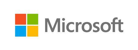
The intent behind the new logo was explained by the company in a post to its official blog on Thursday. Jeff Hansen, general manager of brand strategy at Microsoft, said his company wants to have a common look and feel across all of its products, including upcoming launches of Windows 8, Windows Phone 8, and the next version of Office
"This wave of new releases is not only a reimagining of our most popular products, but also represents a new era for Microsoft, so our logo should evolve to visually accentuate this new beginning," Hansen said.
The new logo uses the Segoe font for the Microsoft name. That same font is used by the company in its products as well as its marketing communications.
To the left of the Microsoft name is a symbol of four colored squares akin to the Microsoft logo as well as the Metro user interface found on Windows Phone and Windows 8.
"The symbol is important in a world of digital motion," Hansen explained. "The symbol's squares of color are intended to express the company's diverse portfolio of products."
The new logo will be seen on all of Microsoft's products, including Microsoft.com; retail stores operated by the company in Boston, Mass., Seattle, Wash., and Bellevue, Wash.; and television advertisements and other forms of marketing.
"We're excited about the new logo, but more importantly about this new era in which we're reimagining how our products can help people and businesses throughout the world realize their full potential," Hansen said.


 William Gallagher
 Christine McKee
 Michael Stroup
 William Gallagher and Mike Wuerthele

 Chip Loder
 Andrew Orr