Top Samsung designer denies copying iOS icons while patent expert says Apple design patents should be invalidated
Samsung designer Jeeyuen Wang
Samsung on Tuesday called to the stand Jeeyuen Wang, a senior designer at the South Korean company who gave testimony through a translator, in an effort to counter Apple's allegations that multiple Samsung devices copied the layout and imagery of iOS, reports CNet.
Earlier in the trial, Apple offered internal Samsung documents which compared the iPhone side-by-side with the Korean company's handsets, alleging iOS icons and UI assets were blatantly copied. Wang admitted that she did look at products from other companies, including Apple, but denied stealing the icons outright, saying instead that it was part of the design process.
"I also look at the icons that come up on Web sites or Webs, and airport signing systems, so I'd pay attention to all these things," Wang said.
The designer claims hundreds of people around the world worked tirelessly on Samsung's iconography, adding that she herself was only able to sleep two or three hours a night.
In refuting Apple's copycat accusations, Wang gave specific examples of how the designs of certain icons were decided. She notes the photo app icon seen on Samsung handsets was inspired by a wallpaper image, and not the sunflower icon that appears in iOS.
"At the time, there was a wallpaper that was in the image of flowers for an AMOLED LCDs and everyone in our team kind of liked the image," Wang said. "We had come to a conclusion that we would adopt this image for the icon."
Wang also said Samsung's phone app icon, referred to internally as a "dumbbell," was there before she began work on the project in 2002 and was green because the color had the connotation of "go."
Page from Samsung's "Mobile icon design for 2011" document. | Source: Apple v. Samsung court documents
During cross-examination, Apple counsel introduced yet another internal Samsung document titled "Samsung mobile icon design for 2011," which studied the effectiveness of its iconography changes from 2007 to 2011. Included in the document were more comparisons to the iPhone as well as sections titled "Design direction" and "Design approach," the latter of which contained an example iOS guideline that ensures third-party icons remain consistent across the platform. The appendix contained hyperlinks to developer icon guidelines for Apple's Mac OS X and Android.
Apple then brought out the 132-page "relative evaluation report" and asked Wang how the company's phone app icon design changed from a number pad to the so-called "dumbbell" image seen on current handsets. The designer claimed she had never seen the document or the old phone app icon before.
"This is a very confusing icon," Wang said, referring to the calculator-like phone icon. "When I looked at it for the first time since getting here it looked like a calculator to me, so it's hard for me to recognize it as a phone."
Patent expert Itay Sherman
Following Wang's testimony was Itay Sherman, avid inventor and CEO of multi-touch company DoubleTouch, who took the stand to argue against the validity of Apple's design patents.
According to in-court reports from All Things D, Sherman's testimony took shots at Apple's design patents, which he says are functional rather than ornamental. The patent expert also argued a number of alleged prior art claims, including a Japanese design patent from 2005 that bears passing resemblance to the iPhone with its rounded corners, rectangular shape and "lozenge-shaped" speaker.
Sherman said the Japanese property alone should be enough to invalidate two iPhone patents because it “renders both of these designs obvious,†but brought up another Japanese patent as well as LG's Prada handset to demonstrate Apple's designs are "obvious."
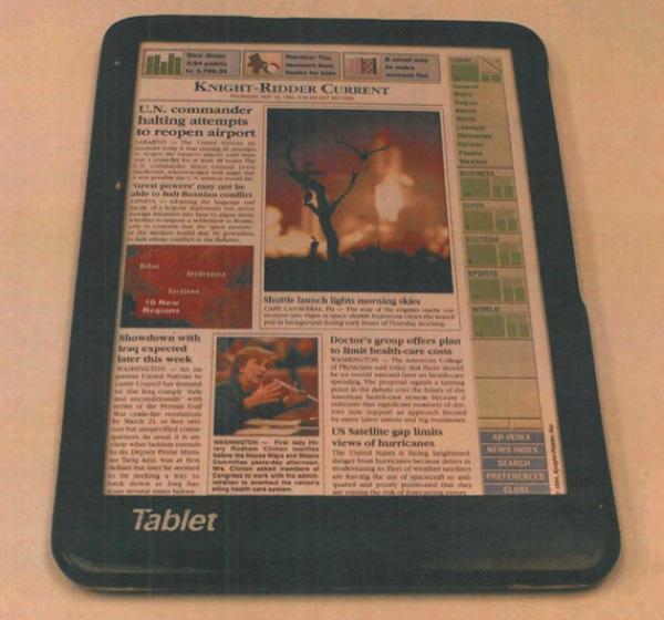
Samsung moved to Apple's iPad design patents, which Sherman also said should be rendered obvious as two alleged prior art designs, the 1994 Fidler tablet concept and Compaq's TC1000 tablet computer from 2002, both share the iPad's thin, rectangular shape with rounded corners. The rectangle shape has been a major argument in Samsung's defense strategy, and Sherman hammered it home by saying the shape of the iPad and iPhone is functional, not ornamental. He explains the design elements of the devices are dictated by the content meant to be displayed on them, like webpages and movies, which happen to be rectangular.
As for the Fidler design, creator Roger Fidler appeared in a brief video deposition directly prior to Sherman's testimony and claimed he showed the tablet concept to Apple in 1994, reports CNet. The publication points out Apple would apply for an iPad-related design patent that same year. Fidler goes on to say that he worked with Apple and a number of other tech companies at the Informational Design Laboratory in Boulder, Colo., to see if his design could be brought to market. The project was ultimately scrapped.
During cross-examination, Apple' lawyer brought Sherman's pedigree into question, saying that he is an electrical engineer and not a designer. In arguing against the Compaq tablet claims, Apple notes the tablet's border design differs from the iPad's monolithic glass facade.
In opposition to Sherman's assertion that the iPad's design is based on function, Apple presented an alternative design example in a teardrop-shaped tablet made by Sony. The iPhone's design patents were also discussed, with Apple's lawyer pointing out small discrepancies in design like the raised button on the LG Prada's front screen.
Apple v. Samsung is set to continue throughout the week with closing arguments set for next Tuesday.
 Mikey Campbell


 Charles Martin
 Christine McKee
 Malcolm Owen
 Mike Wuerthele

 Chip Loder



96 Comments
That Fidler tablet looks like a mockup with a newspaper-clipping glued onto the face!
"The rectangle shape has been a major argument in Samsung's defense strategy, and Sherman hammered it home by saying the shape of the iPad and iPhone is functional, not ornamental. He explains the design elements of the devices are dictated by the content meant to be displayed on them, like webpages and movies, which happen to be rectangular."
Nuff' said...those patents are complete BS
That Fidler tablet looks like a mockup with a newspaper-clipping glued onto the face!
Apple lawsuit has no merit..they have never invented anything just copy here and there like anyone else..
I really don't give a rats ass about the dam Apple vs Samsung lawsuit. Is the technology field so slow these days that the site needs to fill up the pages with the boring legal wrangling between these two companies? Can we get back to reporting on real technological innovations?
[quote name="daylove22" url="/t/151924/top-samsung-designer-denies-copying-ios-icons-while-patent-expert-says-apple-design-patents-should-be-invalidated#post_2168576"]Apple lawsuit has no merit..they have never invented anything just copy here and there like anyone else.. [/quote] I'm an Android fan like none-other but that is entirely bullshit. They are fully and appropriately credited with reinvigorating (or perhaps even launching) the modern smartphone market. Without them we'd just NOW probably be getting a phone of the caliber of the original iPhone (maybe a bit more powerful but still). Maybe they didn't invent the specific tech but their vision has led to some great strides in the tech sector. I do not agree with their lawsuits (at least a lot of them) but to deny them credit is either a lie or purposeful blindness.