Ex Apple engineer claims Steve Jobs rejected new Apple TV UI 5 years ago [u]
 AppleInsider Staff
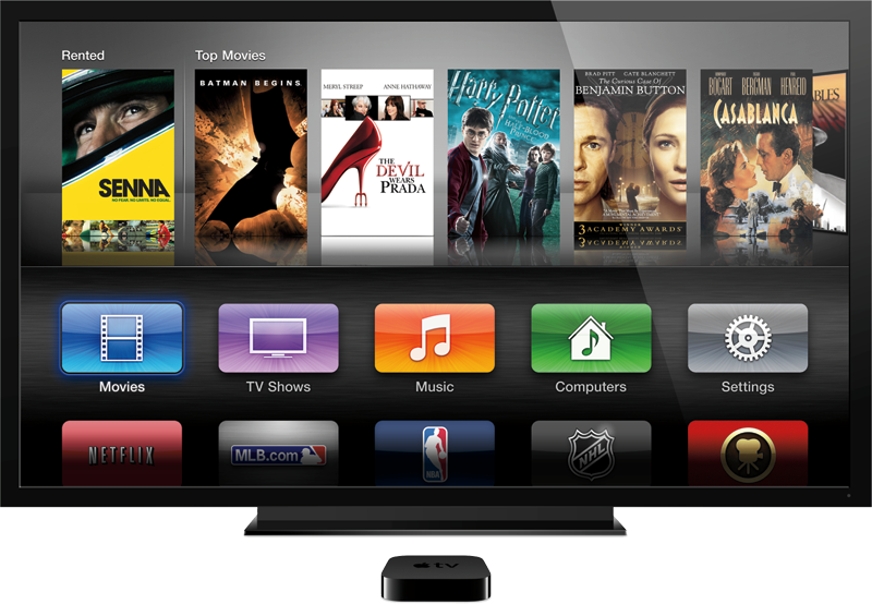
The Apple TV user interface was updated when the new 1080p model was released earlier this month. It features a more iOS-like interface that presents services like Netflix, Vimeo, YouTube and more as icons, rather than burying them in menus.
Since the user interface update rolled out, some have decried it as an ugly design, and a rare step backward for the company. This week, Michael Margolis, a former senior software engineer at Apple, claimed via Twitter that the new designs were presented to Jobs five years ago, but he rejected them.
The comment from Margolis, highlighted by The Next Web and Macgasm, was made in response to designer and entrepreneur Aral Balkan, who told Margolis via the social networking site that he "loved the old UI."
"Fun fact - those designs were tossed out 5 years ago because SJ didn't like them," Margolis responded. "Now there is nobody to say 'no' to bad design."
Balkan then asked who is now in charge of user experience at Apple, saying he hopes the new Apple TV interface "isn't a sign of what's to come."
"Just one visual designer in the consumer apps team," Margolis wrote. "No clue if he is still there, that whole team has left/been replaced AFAIK."
Margolis started the discussion by saying on his Twitter account that he "implemented much of the Apple TV 2.0 UI years ago." He added that the new user interface "makes (him) cry."
Presenting the new Apple TV and its user interface earlier this month, Apple executive Eddy Cue portrayed it as a simplified design that will make it easier for users to access features on the set-top box. Phil Schiller, Apple's senior vice president of Worldwide Marketing, also said in a press release that the new interface makes the Apple TV "easier than ever to use."
Update: Margolis clarified his original remarks in comments at The Next Web:
Correction: I was telling @aral that AppleTV was not designed by Ive, it was designed by one (very talented) designer in the consumer apps team. I was not implying the consumer apps team only had one designer. Most of the AppleTV UI remains unchanged since AppleTV "Take 2" and I think that's a testament to how good it was. Great design is timeless.
The new UI shouldn’t come as a surprise to anyone. There is a clear effort at Apple to make everything match the look and feel of their popular iOS products – starting with Lion and increasing momentum with Mountain Lion.
To be clear – he didn’t like the original grid. This was before the iPhone was popular and before the iPad even existed.
Given that the iPad is far more successful than the AppleTV, migrating the AppleTV to look more like the iPad was probably a very smart move – even if some of the users of the old UI don’t prefer the new one.


 Mike Wuerthele

 Malcolm Owen
 Chip Loder
 William Gallagher
 Christine McKee
 Michael Stroup