Windows 8 appears to adopt Mac OS X Lion's monochrome, iPad-like icons
 Daniel Eran Dilger
Microsoft's Windows 8 video was intended to highlight the new ability of the future operating system to mount and eject volumes, similar to Mac OS X's disk image mounting of .dmg or .iso files or Mac OS 9's .smi or .img image file mounting.
Windows users have historically needed to install a third party tool to mount and view the contents of a disk image file. Windows 8 will finally add the ability to mount ISO disc images and VHD (virtual hard drive) disk images and work with their contents.
However, the new video also shows another element of the upcoming Windows 8 design: a touch friendly Start menu that abandons most of the typical contents of the customary Windows Start menu, and instead supplies just Settings, Devices, Share, and Search options.
Each option is depicted along with a simple monochrome icon that appears to be pattered after the style of Apple's iOS, and widely employed by the iPad's minimalist user interface (shown below).
With Mac OS X Lion, Apple brought its minimalist black and white icons to the Mac desktop, replacing the often photorealistic color icons in many apps' menu bars with highly simplified iPad-like icons.
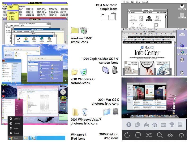
A history of iconic innovations
Apple's original Macintosh graphical user interface popularized the term "icon" in computing. Prior to the Mac, "icon" held a distinct connotation of religious artwork associated with Orthodox Christianity, related to presenting ideas packed with simplified, metaphorical analogy.
Microsoft copied Apple's iconic desktop, even hiring the same artist (Susan Kare) to craft similar representations of such ideas as folders, documents and applications (all of which were, like "icon" itself, similarly coined by Apple to make the existing concepts of subdirectories, files and executables more accessible to non-technical users).
Apple's attempts to advance the sophistication and look of the original Mac desktop culminated in 1994's Copland, a scuttled effort that had some of its elements salvaged by Steve Jobs to sell the existing Mac System 7 as Mac OS 8 and 9, using a refreshed visual appearance that made heavy use of cartoonish, colorful icons.
Microsoft subsequently adopted the cartoonish look of Copland/Mac OS 8 with Windows XP. Apple then moved toward photorealistic icons first pioneered by NeXT in the release of Mac OS X, where documents and icons were given highly detailed representations complete with translucency effects to take full advantage of higher resolution displays.
Six years later, Microsoft released Windows Vista with similarly detailed, photorealistic graphics and transparency effects. Since the release of the iPad, Apple has reverted the tool bars and other elements of Mac OS X (such as the iTunes source list and Finder sidebar) to use high contrast outlines, reminiscent of the original icons of the black and white Macintosh from 1984.


 Charles Martin
 Christine McKee
 Malcolm Owen
 Mike Wuerthele


 Chip Loder


158 Comments
I'm liking the monochrome but there is a whole lot of other stuff that seems to be adding clutter and confusion to the UI.
I never knew MS had a design / R&D department, I always believed the story about them using Apple for that!
Microsoft copies Apple?? Oh noes!!!
hey...those icons are from Zune HD and Windows Phone. nice try. :-D
No. This is the Metro UI style. It's been around since the Zune all those years ago. They're just bringing it to Windows.