Apple investigating scrollable menus, toolbars for Mac OS X, iOS
 AppleInsider Staff
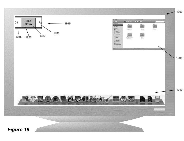
The plans were revealed in a patent application filed last week in Europe, under the name "Scrollable Menus and Toolbars." The document describes a system that would allow users to select an area and then scroll through menu items, giving a greater selection than can be displayed on the screen at one time.
The application notes that toolbars and menus for typical commands, such as opening a file or saving a document, "can take up valuable real estate in the graphical user interface."
"For example, a user does not want a floating tool palette that takes up too much of the screen," the document reads. "As more options get added to a tool palette, the tool palette must get larger or the size of the options must get smaller."
Apple's solution claims that it would allow an application to display all of those options on a menu or toolbar without taking up a significant amount of space. Its method would also keep the options on the screen at a "visually recognizable size."
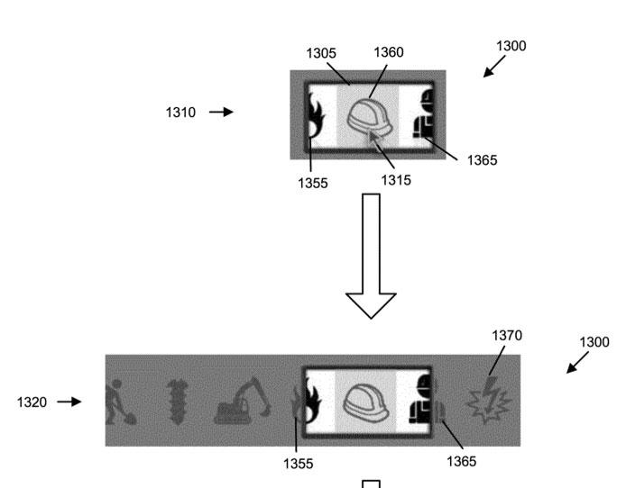
The application describes a toolbar with a list of icons on a screen. Hovering over or touching the space would bring up a new window that would indicate to the user what option they are about to select.
Users could choose other selections by scrolling either left and right or up and down. A number of icons would be displayed on the screen, with the one to be selected highlighted to stand out.

Apple's proposed invention gives a number of methods to display these icons, including scrollable menus that would show the selected icon in the center and half of an icon to either the left or the right. Another proposed method would have the icons scroll in a circular rotation, like on a wheel.
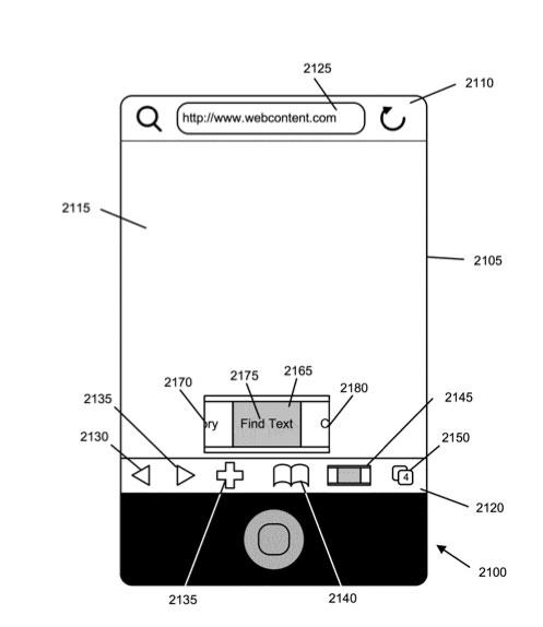
Potential uses for the invention are demonstrated on both a Mac and an iPhone. One example shown would give users the ability to search for text on an iPhone within its Safari browser. In another example, users are given the option to shut down or restart a computer running Mac OS X with a selection window in the top left corner.


 William Gallagher

 Andrew Orr

 Mike Wuerthele and Malcolm Owen

 Andrew O'Hara
 Charles Martin


26 Comments
If I were Apple, I would ensure that my OS GUI is consistent across all applications (especially Apple owned apps) before I would introduce new GUI elements...
Is this supposedly going to look like the shiny mini-photo-browser in iPhoto '11?
Apple has shown interest in a new graphical user interface element that would allow devices running either Mac OS X or iOS to consolidate toolbars and menus and cut down on screen clutter...
This is the third article I've read today on this patent application and not a one of them really explains it very well.
It looks groovy, but what the f*ck is it really? I like to see a good explanation of how this would actually work in practice.
Multitouch would obviously be key for this to work. I see this as having potential.
This is the third article I've read today on this patent application and not a one of them really explains it very well.
It looks groovy, but what the f*ck is it really? I like to see a good explanation of how this would actually work in practice.
indeed i didn't understand most of it - but i'll tell you that the feature i hate the most in windows 7 is the default hiding of the menu bar.
a lot of these diagrams remind me of stuff we've seen in websites as designers try to outdo each other. This led to my hating flash for a big reason - every site tried to reinvent the wheel - why should i have to relearn the basics of an interface for just a bunch of links? That's why os gui's have to have consistency and there should be certain conventions respected